Font Downloads
Click to download
Proportional Regular

Proportional Bold
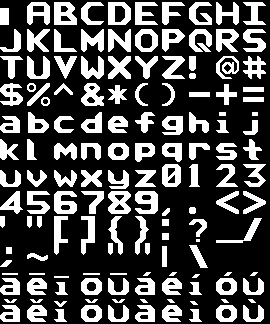
Monospace Regular
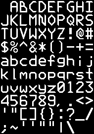
Monospace Bold
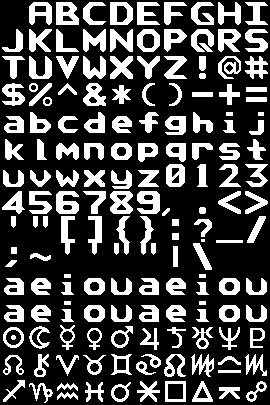
Upper and Symbol
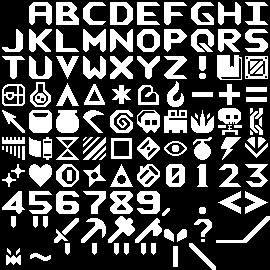
Dimensions


| Part | Bold | Reg |
|---|---|---|
| 1: Stem thickness | 7 | 3 |
| 2: Arm / Bowl thickness | 4 | 3 |
| 3: Length of latitude/longitude cross-section of diagonal | 8 | 4 |
| 4: Cross-bar thickness | 4 | 3 |
| 5: Length of perpendicular cross-section of diagonal | 8 | 4 |
| 6: Margin | 2 | 2 |


| Section | Bold | Regular |
|---|---|---|
| 1: Ascender | 21 | 23 |
| 2: Bowl height | 14 | 15 |
| H-margin | 3 | 6 |
| Bowl Width | 21 | 15 |


| Section | Bold | Regular |
|---|---|---|
| 1: Turn edge length | 4 | 4 |
| Cross bar height | 13 | 12 |
| Hook width | 14 | 10 |
| Letter width | 20 | 15 |


| Section | Bold | Regular |
|---|---|---|
| 1: Bowl height | 10 | 10 |
| Arm height | 17 | 17 |
| Letter width | 20 | 15 |


| Section | Bold | Regular |
|---|---|---|
| Horizontal cross section of diagonal | 7 | 3 / 4 |
| Point width | 1 | 3 |

| Section | Pixels |
|---|---|
| 1: Bottom Point Width | 3 |
| 2:Top Point Width | 2 |
| 3: Length of latitude/longitude cross-section of diagonal | 4 |
| 4: Length of perpendicular cross-section of diagonal | 4 |
- If made symmetrical, the diagonal would be 1 pixel thicker. This would be stick out when reading.
- Instead, the Z has a difference in sharpness in the top and bottom points. This is not noticible when reading.